1. In what ways does your media product
use, develop or challenge forms and conventions of real media products?
The main influence for our
media product came from the ghost hunting spoof, ‘Ghostfacers’ in the American
TV drama, Supernatural. Ghostfacers
is a spoof of ghost hunting TV documentaries. From this we decided to create a
ghost hunting documentary, but to make it more interesting we also decided to
make ours into a spoof, so it became more of a mockumentary rather than just an
informative documentary.
To help us get a better idea
of what actual ghost hunting documentaries are like, we looked at real life
documentaries that have been produced, such as Ghost Hunters and Most
Haunted. From these documentaries we saw that they usually work in teams
and can be seen checking out locations and setting up CCTV cameras. We took
these ideas and used them in our production. We have also taken the idea of
using the camera man’s point of view when filming certain shots, and being able
to hear him talking from behind the camera. One of the main features in ghost
hunting documentaries is using night vision cameras for the CCTV footage, we
also used this because it helped to make our production more realistic.
We have challenged the
normal conventions of a documentary by creating our production in the style of
a spoof. We have continued to use the normal conventions of documentaries by
using talking heads, where each member of the team is interviewed separately
while introducing themselves to the audience. However, the audience does not
hear the questions that have been asked. We have also used the idea of an “after
the break” section, which gives the audience a preview of what is coming up in
the rest of the documentary to keep them watching.
2. How effective is the combination of your
main product and ancillary tasks?
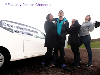
 I believe that our first ancillary task; the poster, is not
effective as it isn’t clear that it is advertising a ghost hunting documentary.
This is because the poster only shows a picture of the team standing next to a
car with the name of the production on the side of it, however it also has the
time and date for when it is being aired, as well as what channel it is on, in
this way people maybe be curious to find out what the poster is for and therefore
watch it. I believe the poster would have been more effective if it was a
picture of the team standing in a spooky location with a short description
under the title of the show, such as “Spooky locations and new horrors, follow
the newest team of ghost hunters on their terrifying investigations!” Still
including the time, date and channel the show will be aired on. By doing this
the audience who see the poster would have a better and clearer understanding
of what the show is about, and therefore draw in a larger audience.
The second ancillary task; the double page magazine spread, is
more effective. This is because it is an interview with the crew members,
accompanied by pictures of the team and images from the production. By showing
images of the crew and production it helps to draw readers in, as they may be
curious about who and what the interviews are about. If they find the interview
interesting, they might want to watch the documentary. We have also used a dark
background of a shadowed forest to help draw in more readers and create an
effect which reflects and suits the production.
3. What have you learned from your audience
feedback?
In order to improve our media product,
we needed to gain feedback from others. We gained this audience feedback by
sharing our first cut with our teacher and class. We were told that our hand
held shots suited the style of the documentary, but some shots were too shaky. However,
we were unable to use the same location again so we weren’t able to re-film the
shots that were too shaky, instead we cut out some of it. The feedback also
said that some of our sound levels were inconsistent, and some sound such as
the censoring had to be changed as they could still hear the swearing. We were
told that we needed to create a voice over to introduce our piece as the
audience didn’t understand what it was at the beginning. From this we learned
that if we don’t give the audience enough relevant information about what they’re
watching they may not find as much enjoyment out of watching our product.
We used low key lighting in half of our
piece to make it seem scarier, however the audience said that some of our shots
were too dark so we needed to fix this by adjusting the lighting levels on some
of these clips. They also pointed out that the colour contrast on our opening
scene is very high and very bright, but this was due to something going wrong
with the camera and we couldn’t get these colour levels to look more natural. But
some of the audience said that this created a very good supernatural effect. From
this we learned that we needed to ensure that the camera we are using will
produce a good quality beforehand, or this may hinder the quality of our piece.
After watching our product, we told the
audience that we hadn’t yet added a night vision filter over certain shots as
we were waiting for the software, and they said that they thought it would look
very good with it. After we presented our final cut to the same audience they
said that the filter we added created a more suspenseful atmosphere as the
night vision is typically used in this way in ghost hunting documentaries.
4. How did you use media technologies in
the construction and research, planning and evaluation stages?

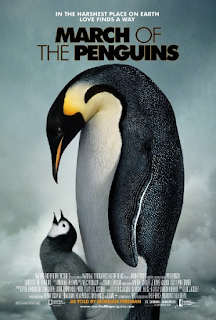
Before creating our documentary we first discussed what type of documentary we wanted to do. After watching March of the penguins and TT Closer to the Edge, we decided that we didn't want to create one based on nature or large events as not only would they be hard to capture, but we also wanted to make it comedic. We later decided that we wanted to create a ghost hunting documentary and looked at examples of them like Ghost Adventures.
We filmed our production using a Panasonic Full HD Camcorder. Our filming took place in a spare meeting room in school, a local graveyard and Ashleigh's Aunt's garage. For post-production we used Adobe Premiere because we used it last year so we had some experience using it already, making the editing process much easier than if we used a new software. We also used Adobe After Effects to create the night vision filter on our CCTV footage; we hadn't used this before so it took a while to understand how to use it, so we looked up a tutorial on YouTube to use the night vision filter. We also used Adobe Photoshop and Microsoft Publisher to create our ancillary tasks, this again was easy because we have past experience in using these softwares.
For this evaluation we decided to write it out in Microsoft Word as it helped us to keep track of word counts and text fonts, sizes and layout, and we also had lots of experience using this software. We then pasted the writing into Blogger and then added the images that we have taken from either google or our piece.


